

Bootstrap properties
Thewindow.marqeta.bootstrap() function is the single entry point for configuring UX Toolkit at runtime. The fields below are passed to it.
Bootstrap examples
Minimal — sandbox, default theme, default language:Themes
UX Toolkit components ship with a default theme; you can customize this theme so the components align more closely with your brand. Theming is a two-part workflow:- Design your theme in Studio — an interactive design environment.
- Upload your theme via the API — the
POST /themeendpoint deploys it to the Marqeta platform for use with your card program.
Designing your theme in Studio
Studio is an interactive theming environment where you can fine-tune the appearance of UX Toolkit UI components before integrating them. With Studio, you can preview and test the look-and-feel of components on various device types (mobile phone, tablet, and desktop). While in Studio, you can click into each component to access its full functionality. Each component has both an Overview page and a Customize page that are linked together — any changes made on the Customize page carry over to the Overview page. You can choose to work in Studio with or without authenticating:- Authenticated mode — Studio is populated with your program’s details and data instead of using the default Studio-simulated data.
- Unauthenticated mode — you work with the simulated data Studio provides.
Run the Auth Params CLI script, replacing each placeholder with your value from the table above:
Authenticate when working with Studio
To authenticate when working with Studio, follow these steps: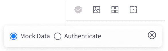
- Access Studio.
- In the upper-left corner of the screen, click the Authentication icon to load the modal window.
- Select the Authenticate option button.
- Paste the JSON output from the script into the Auth Params field, then click Authenticate. When the icon turns green, you have successfully switched to authenticated mode.
Editing and sharing an existing Studio theme
If you are part of a collaborative effort building a theme and want to share your work with others, share the theme as a JSON file. Consider hosting a copy of your theme’s JSON file in your source control repository for safekeeping so you can monitor incremental changes made to it by team members. Your Studio theme is not applied to your card product or program until you upload it to the Marqeta platform via thePOST /theme endpoint (see Uploading your theme via the API, below).
You cannot download and edit a Studio theme once it has been uploaded to the Marqeta platform. The Marqeta platform does not retain a version history of your theme’s JSON file. To edit a locally saved copy of your theme:
- Paste your theme’s JSON content into Studio.
- Make your modifications directly in the Studio interface.
- Save the JSON file locally or in your source control repository.
- Upload the JSON file to the Marqeta platform to overwrite the existing theme.
Note
If you close or refresh the browser tab where Studio is running, your customized theme values will be lost. Likewise, if you authenticate with Studio, you will be logged out after closing or refreshing the Studio tab.
If you close or refresh the browser tab where Studio is running, your customized theme values will be lost. Likewise, if you authenticate with Studio, you will be logged out after closing or refreshing the Studio tab.
Uploading your theme via the API
After you have developed your theme in Studio, save it as a JSON file and upload a copy to the Marqeta platform. The example cURL below uploads a theme namednew-theme-name:
bootstrap() to include the theme:
POST /theme endpoint, see Uploading a Studio theme in the UX Toolkit API reference.
Card art
UX Toolkit lets you upload custom card art for each card product in your program. You can submit up to three images per card product:- An image displayed on the front of the card.
- An image displayed on the back of the card (digital cards only — virtual cards have no back image).
- A thumbnail-sized image of the front of the card.
mq-card and mq-card-list components.
Digital (physical) cards
Front of card. A digital version of the front of the physical card

Virtual cards
Front of card. Represents the virtual card. Virtual cards have no back-of-card image.
Card art specifications
Submitted images must adhere to the following specifications:Uploading card art to the Marqeta platform
After your images have been approved by Marqeta, your bank, and the card network, you can upload them to the Marqeta platform for use in Studio and your application. You can upload card art via the/cardproducts/cardart endpoint of the UX Toolkit service. The example cURL below uploads file.png:
asset_type values: front, back, thumbnail.
For full reference, see Upload card art in the UX Toolkit API reference.
Translations
UX Toolkit web components default to American English (en-US). The internationalization feature lets you change the language of components by uploading custom translation files via the /translations endpoint and referencing them in bootstrap().
Working with custom translation files
Note
Upload your custom translation files via the
Upload your custom translation files via the
/translations endpoint before calling the bootstrap() function — bootstrap() references them by language code, so they must already exist on the Marqeta platform when the call is made.- Ensure your custom translation files are linguistically accurate.
- Upload them via the
/translationsendpoint. (See Upload custom translation files in the UX Toolkit API reference.) - Test your files in Studio.
- Update your
bootstrap()call to include the language code:
Testing translations in Studio
You can use Studio to test translation values.Note
To test custom translation files, you must be authenticated within Studio.
To test custom translation files, you must be authenticated within Studio.
- Request the translations object file for your target language from Marqeta.
- Customize the values in the object file in your target language.
- Send a request using the customized object to the
/translationsendpoint. - Authenticate in Studio. To switch to authenticated mode, follow these steps:
- Access Studio.
- In the upper-left corner of the screen, click the Authentication icon to load the modal window.
- Select the Authenticate option button.
- Paste the JSON output from the script into the Auth Params field, then click Authenticate. When the icon turns green, you have successfully switched to authenticated mode.
- In Studio, click the globe icon in the top menu navigation bar to confirm your custom translations have been applied. Available languages are listed in the drop-down beneath the globe icon.
- Select a language from the list.
Note
Use the Customize tab in Studio to view any updates that you have made to the components’ display language.
Use the Customize tab in Studio to view any updates that you have made to the components’ display language.